


Coloring of emergency lamps
Coloring of emergency lamps
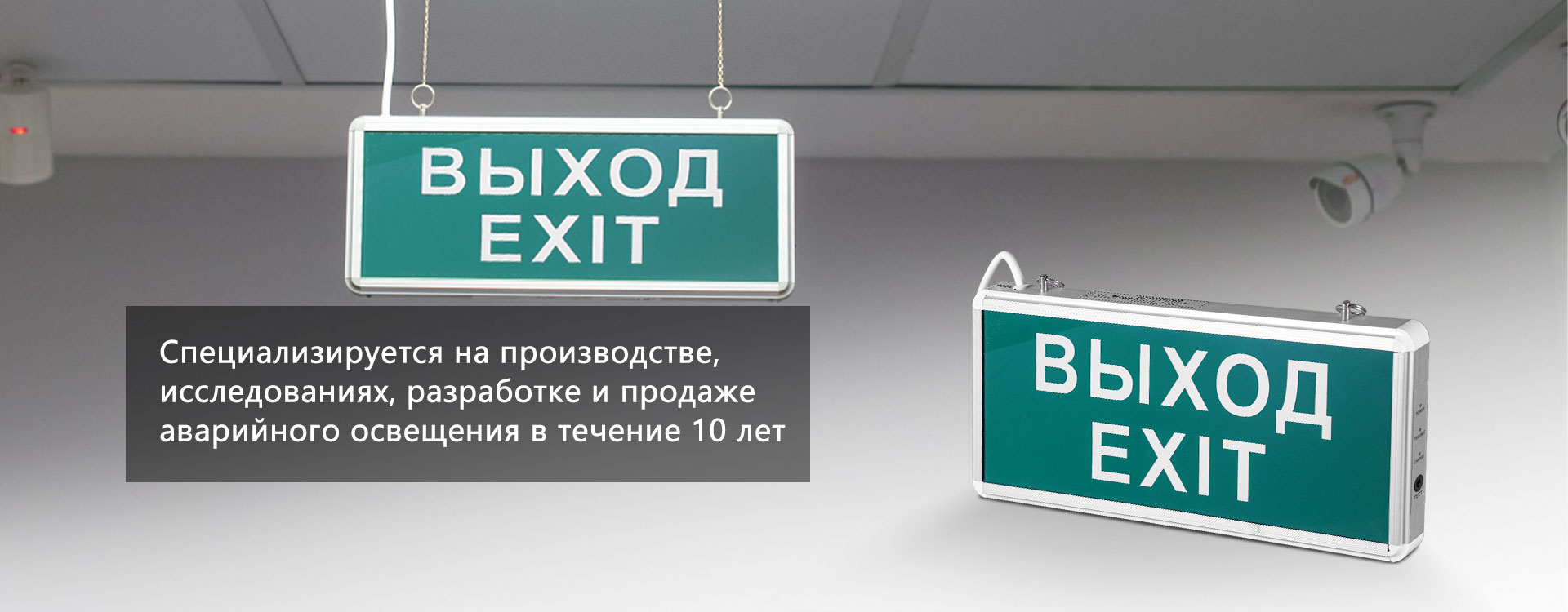
Emergency lamps are indispensable assistants in case of disconnecting the main lighting. They guarantee security and orientation in the building during emergency situations such as fires, accidents or power outages. But what if the emergency lamp was forgotten, and its color faded, became unreadable or unattractive? How to choose the right optimal color for maximum efficiency and aesthetics?
Choosing color for maximum visibility
The first and most important rule is that the emergency lamp should be noticeable in conditions of insufficient light. The best option is a bright, contrasting color that will stand out well against the background of the environment. Do not forget that bright colors are not necessarily screaming tones. Bright yellow, orange or light green is quite suitable. Avoid pastel shades that can merge with the surface and become unreadable in insufficient lighting conditions. In addition, it is important to consider the color of the walls and ceiling in the rooms in order to ensure maximum contrast.
We take into account the specifics of the room
Different rooms have different coloring requirements. For example, in corridors and halls, where the most wide visibility is necessary, more vivid colors are preferable. In medical institutions or places with increased danger, colors that can be distracting or cause anxiety should be avoided. An accurate consultation with security and design experts is needed. For example, in residential premises, more calm and harmoniously combined with the interior color is preferable. The lighting that emergency lamps provide should be comfortable for the eyes and not cause discomfort.
Impact on perception and aesthetics
Do not forget about perception and aesthetic effect of color. Even the emergency lamp may fit into the interior and not cause discomfort. The combination of the color of emergency lamps with the total color scheme of the room will help create a harmonious and attractive environment. It is important to remember that the lamp should be functional primarily and provide the necessary visibility, and aesthetic nuances - only an additional plus. Coordination of colors with the architectural features of the building and interior design will make an emergency lamp with an element of decor, and not an extraneous object.
AppropriateProducts
Corresponding products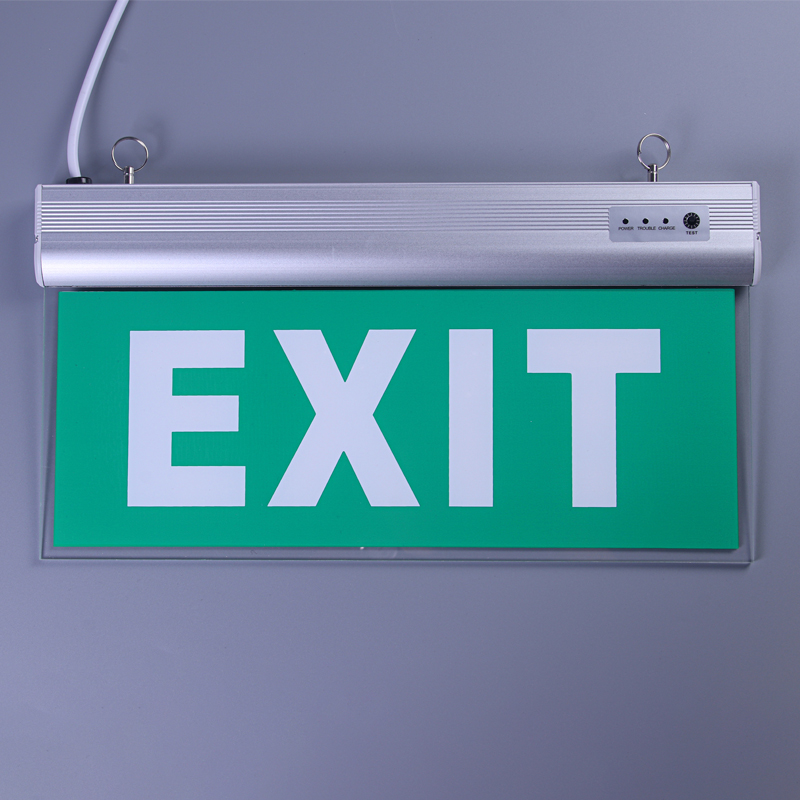

The best soldproducts
The best -selling products-
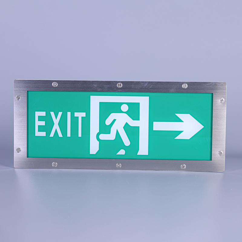
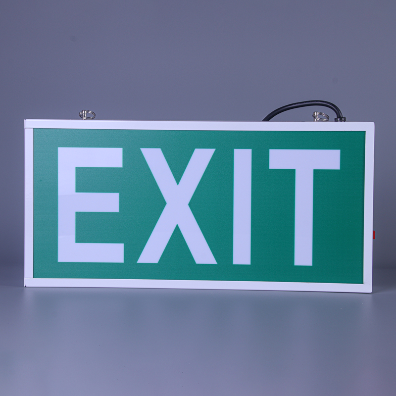 LED rechargeable emergency sign of output light of emergency light box Box
 -
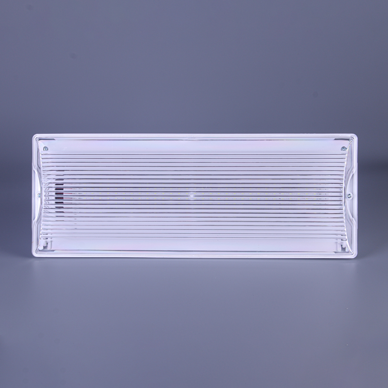
.jpg) 6W LED automatic emergency lamp
6W LED automatic emergency lamp -
 IP65 3W/6W/8W rechargeable SMD LED automatic emergency lamp
 -
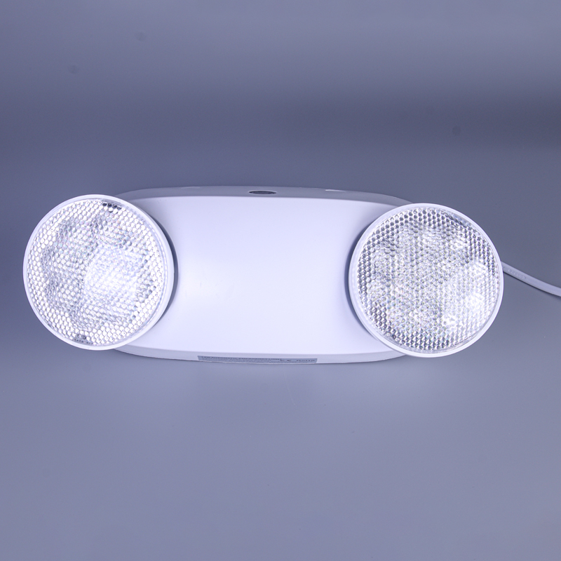
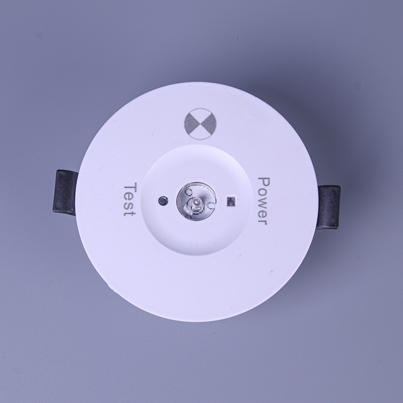 3W LED emergency ceiling lamp
 -
 IP65 3W Led Automatic emergency lamp output sign
 -
 3 watts rechargeable Avaritic light emergency emergency emergency
 -
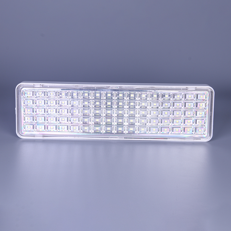 Lithium battery of 80 LEDs Emergency LED lamp
 -
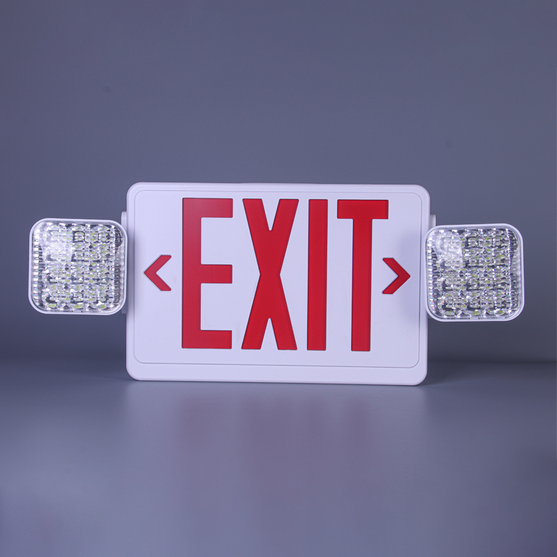
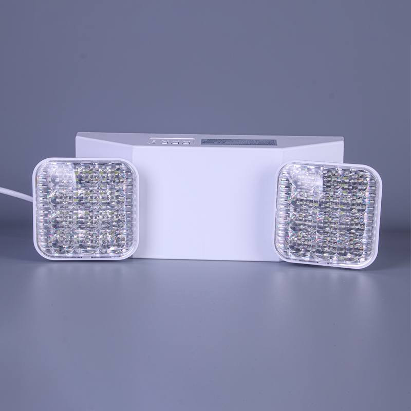
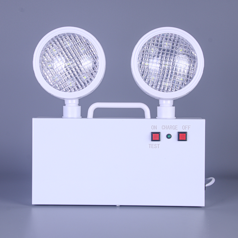 LED emergency lanterns with a double head 9 watts
 -
 IP65 3W/6W/8W Waterproof LED automatic emergency lamp
 -
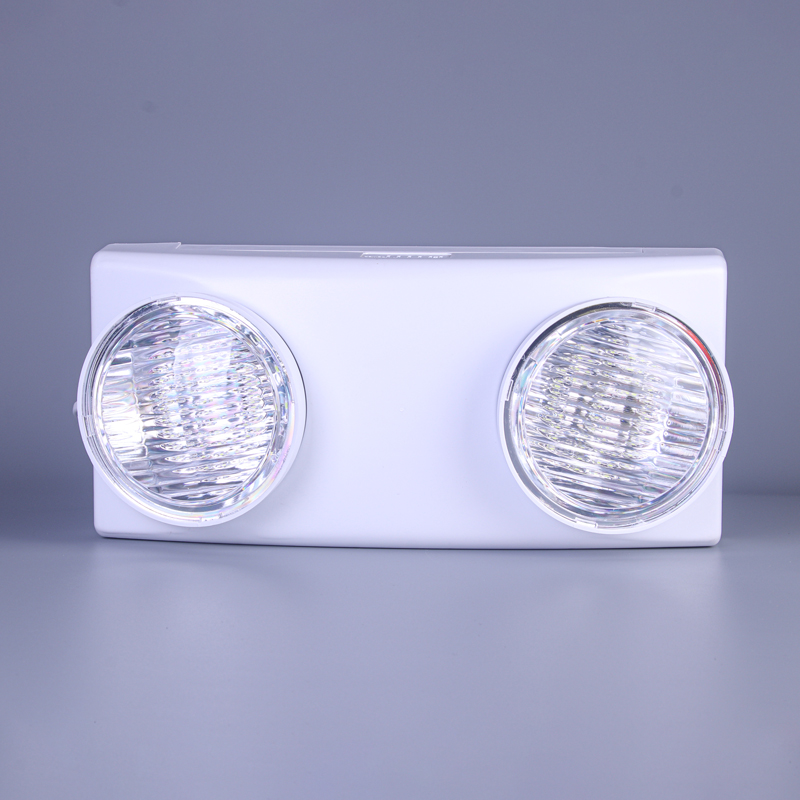
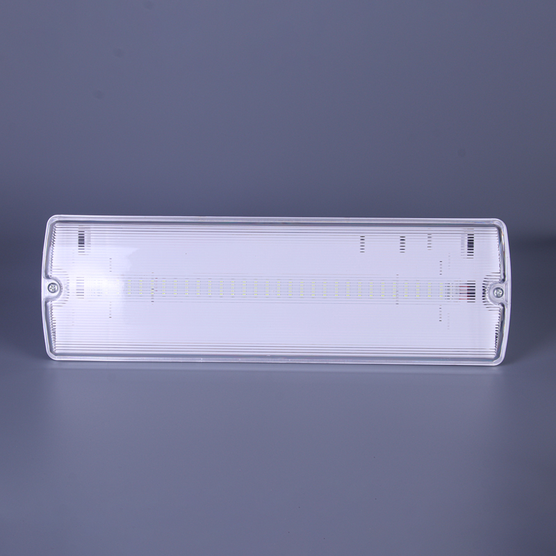
 LED rechargeable emergency lamp with a capacity of 6 watts
 -
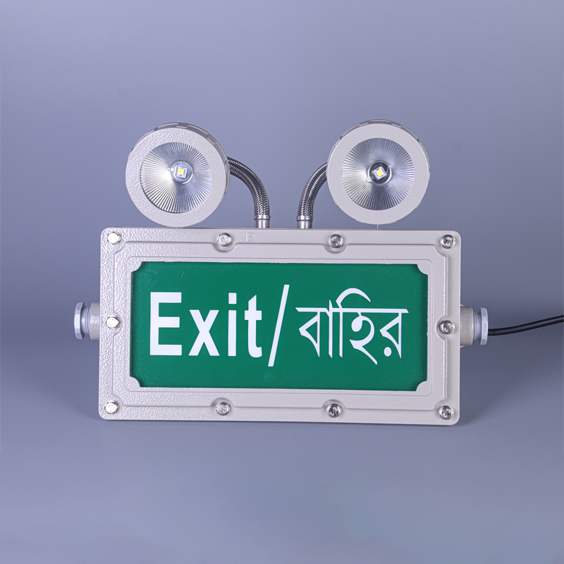 Double head 3W Explosion -proof LED output of emergency lamps
 -
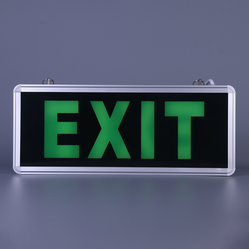 3W emergency LED exit sign Light of the Board Management
Connectedsearch
Related search- China Emergency Lighting Durable Security Factory
- Buy emergency lights 4000k Plant
- China manufacturer of emergency security 4 hours
- China suppliers of emergency LED lighting IP65
- Chinese emergency lighting suppliers Work hours
- Buy a plant LED emergency light with a battery
- China Pictogram of the emergency release of the light of suppliers
- buy emergency light lamps
- Chinese emergency lighting suppliers on the evacuation routes
- Chinese emergency lighting manufacturers with a battery